## Description

This PR adds more documentation for `TextEditingController(String text)` constructor and it adds one example.

https://github.com/flutter/flutter/pull/96245 was a first improvement to the documentation.
https://github.com/flutter/flutter/issues/79495 tried to hide the cursor when an invalid selection is set but it was reverted.
https://github.com/flutter/flutter/pull/123777 mitigated the issue of having a default invalid selection: it takes care of setting a proper selection when a text field is focused and its controller selection is not initialized.

I will try changing the initial selection in another PR, but It will probably break several existing tests.

## Related Issue

Fixes https://github.com/flutter/flutter/issues/95978

## Tests

Adds 1 test for the new example.
Entire pr generated with [ktlint](https://github.com/pinterest/ktlint) --format. First step before enabling linting as part of presubmit for kotlin changes.
Add column information as table header for `flutter emulators` command.
**Before:**
```
2 available emulators:
Pixel_3_API_30 ⢠Pixel 3 API 30 ⢠Google ⢠android
Resizable_API_33 ⢠Resizable API 33 ⢠Google ⢠android
To run an emulator, run 'flutter emulators --launch <emulator id>'.
To create a new emulator, run 'flutter emulators --create [--name xyz]'.
You can find more information on managing emulators at the links below:
https://developer.android.com/studio/run/managing-avdshttps://developer.android.com/studio/command-line/avdmanager
```
**After:**
```
2 available emulators:
Id ⢠Name ⢠Manufacturer ⢠Platform
Pixel_3_API_30 ⢠Pixel 3 API 30 ⢠Google ⢠android
Resizable_API_33 ⢠Resizable API 33 ⢠Google ⢠android
To run an emulator, run 'flutter emulators --launch <emulator id>'.
To create a new emulator, run 'flutter emulators --create [--name xyz]'.
You can find more information on managing emulators at the links below:
https://developer.android.com/studio/run/managing-avdshttps://developer.android.com/studio/command-line/avdmanager
```
fixes#140656
* Flags to `dart compile wasm`

Some options are not relevant to a standalone user of `dart compile
wasm` (e.g. specyfing dart-sdk, platform file etc). => Those aren't
offered by the `dart compile wasm` tool directly. => We use the
`--extra-compiler-option=` instead which passes through arbitrary
options to the dart2wasm compiler. => We don't maintain compatibility of
those options, if we update them we'll ensure to also update flutter
tools

* Binaryen optimization passes

This change will mean we use the binaryen flags from Dart SDK which are
slightly different from the ones in flutter.

* Optimization configuration

This change will also start using the more standardized `-O` flag for
determining optimization levels. The meaning of those flags have been
mostly aligned with dart2js (with some differences remaining).

* Minimization

Using the new optimization flags, namely `-O4` for `--wasm-opt=full`,
will automatically enable the new `--minify` support. Minification is
Dart semantics preserving but changes the `<obj>.runtimeType.toString()`
to use minified names (just as in dart2js).

* Code size changes

  Overall this change will reduce wonderous code size by around 10%.

Issue https://github.com/dart-lang/sdk/issues/54675
In service of https://github.com/flutter/flutter/issues/143348.

**Issue.** The `equals` implementation of `AssetsEntry` is incorrect. It compares `flavors` lists using reference equality. This PR addresses this.

This also adds a test to make sure valid asset `flavors` declarations are parsed correctly.

While we are here, this PR also includes a couple of refactorings:
  * `flutter_manifest_test.dart` is a bit large. To better match our style guide, I've factored out some related tests into their own file.
  *  A couple of changes to the `_validateListType` function in `flutter_manifest.dart`:
      * The function now returns a list of errors instead of accepting a list to append onto. This is more readable and also allows callers to know which errors were found by the call.
      * The function is renamed to `_validateList` and now accepts an `Object?` instead of an `YamlList`. If the argument is null, an appropriate error message is contained in the output. This saves callers that are only interested in validation from having to write their own null-check, which they all did before.
      * Some error strings were tweaked for increased readability and/or grammatical correctness.
fixes#87061
It doesn't matter whether I'm using Google Chrome, VS Code, Discord, or a Terminal window: any time a text cursor is blinking, it means that the characters I type will show up there.
And this isn't limited to text fields: if I repeatedly press `Tab` to navigate through a website, there's a visual indicator that goes away if I click away from the window, and it comes back if I click or `Alt+Tab` back into it.
<details open>
<summary>Example (Chrome):</summary>

</details>
<details open>
<summary>This PR adds the same functionality to Flutter apps:</summary>

</details>
Update dependencies to latest versions
Related to #142618Fixes#143219
- [ x I read and followed the [Flutter Style Guide], including [Features we expect every widget to implement].
This is an attempt at a reland of https://github.com/flutter/flutter/pull/141396

The main changes here that are different than the original PR is fixes to wire up the `flutter test` command properly with the web renderer.
This is in service of https://github.com/flutter/flutter/pull/141194

This will make it easier to get the `flutter run -d <browser>` and `flutter build fuschia` cases easier to get under test.
This PR is the 7áµÊ° step in the journey to solve issue #136139 and make the entire Flutter repo more readable.
(previous pull requests: #139048, #139882, #141591, #142279, #142634, #142793)
This pull request covers everything in `packages/flutter/lib/src/widgets/`. Most of it should be really straightforward, but there was some refactoring in the `getOffsetToReveal()` function in `two_dimensional_viewport.dart`. I'll add some comments to describe those changes.
This is a direct revert of (the revert of (the reland of (the policy pr))): https://github.com/flutter/flutter/pull/143132.

The only change is:
1. to put a conditional all on one line, because the packages repository has a test that uses an old flutter project to make sure nothing regresses. The old project uses an old gradle version, and the old gradle version bundles an old groovy version, and the old groovy version has a bug where lines that start with `&&` don't always work: https://issues.apache.org/jira/browse/GROOVY-7218 (I enjoy that the revert reason ends up providing another strong justification to go forward with the policy). Also thanks to @reidbaker for pointing out this bug.
2. I also made a slight formatting change to the messages that print when out of the support bounds, which I think looks slightly better.

I tested this with on a branch that included a revert of https://github.com/flutter/flutter/pull/142008, and was able to recreate the failure and verify that it was resolved by 1).
fixes [The InputDecoration's suffix and prefix widget can be tapped even if it does not appear](https://github.com/flutter/flutter/issues/139916)
This PR also updates two existing tests to pass the tests for this PR. These tests are trying to tap prefix and suffix widgets when they're hidden. While the linked issue had visible prefix and suffix widgets https://github.com/flutter/flutter/issues/39376 for reproduction.
### Code sample
<details>
<summary>expand to view the code sample</summary>
```dart
import 'package:flutter/material.dart';
void main() {
runApp(MainApp());
}
class MainApp extends StatelessWidget {
final _messangerKey = GlobalKey<ScaffoldMessengerState>();
MainApp({super.key});
@override
Widget build(BuildContext context) {
return MaterialApp(
scaffoldMessengerKey: _messangerKey,
home: Scaffold(
body: Container(
alignment: Alignment.center,
padding: const EdgeInsets.all(16.0),
child: TextField(
decoration: InputDecoration(
labelText: 'Something',
prefix: GestureDetector(
onTap: () {
_messangerKey.currentState?.showSnackBar(
const SnackBar(content: Text('A tap has occurred')));
},
child: const Icon(Icons.search),
),
suffix: GestureDetector(
onTap: () {
_messangerKey.currentState?.showSnackBar(
const SnackBar(content: Text('A tap has occurred')));
},
child: const Icon(Icons.search),
),
),
),
),
),
);
}
}
```
</details>
### Before

### After

1. Remove `dev_target` from suggested Firebase Test Lab iOS script and use wildcard instead.
2. First run `flutter clean` before building to avoid collisions between runs.
3. Use `zip --must-match` in case the xctestrun or `Release-iphoneos` directories are missing (like ran with `--profile` instead of `--release` on purpose) to fail instead of zipping up only part of what's needed.

This came out of a discussion with FTL about these instructions and I tried to run them locally and avoided setting `dev_target`.

See also #74428
During golden test image comparison 2 lists of a different type are compared with the method "identical", so this will never be true. The test image is a _Uint8ArrayView while the master image is an Uint8List. So that results in always a heavy computation to get the difference between the test and the master image.

When you run this test snippet I go from 51 seconds to 14 seconds:
```dart
import 'package:flutter/material.dart';
import 'package:flutter_test/flutter_test.dart';

void main() {
  for (int i = 0; i < 100; i++) {
    testWidgets('Small test', (WidgetTester tester) async {
      await tester.pumpWidget(Directionality(textDirection: TextDirection.ltr, child: Text('jo')));
      await expectLater(find.byType(Text), matchesGoldenFile('main.png'));
    });
  }
}
```
This PR is the 6áµÊ° step in the journey to solve issue #136139 and make the entire Flutter repo more readable.
(previous pull requests: #139048, #139882, #141591, #142279, #142634)
The current focus is on `packages/flutter/lib/src/material/`. The previous 2 PRs covered files in this directory starting with letters `a-m`; this one takes care of everything else.
We already have a simple app in this repo that fully uses Gradle Kotlin DSL (see #141541). The next small step is to have at least one plugin that also uses Gradle Kotlin DSL. Let's use `integration_test` for that, since it's versioned with Flutter SDK.
Fixes https://github.com/flutter/flutter/issues/138610.

When `RenderImage` receives a new `Image` it only needs to fire up the layout machinery when the dimensions of the image have changed compared to the previous image. If the dimensions are the same, a repaint is sufficient.
Re land of https://github.com/flutter/flutter/pull/142000.
Differences:
1. Fixed the test that was failing in postsubmit. The reason was that the Flutter Gradle Plugin was being applied after KGP in that test, so we couldn't find the KGP version. This caused a log, and the test expects no logs. I moved FGP to after KGP
2. Added to the logs for when we can't find AGP. Change is from
>  "Warning: unable to detect project AGP version. Skipping version checking."

to
> ~"Warning: unable to detect project AGP version. Skipping version checking. \nThis may be because you have applied the Flutter Gradle Plugin after AGP."~

update: the above is wrong, changed to
> "Warning: unable to detect project KGP version. Skipping version checking. \nThis may be because you have applied AGP after the Flutter Gradle Plugin."

3. Added a note to the app-level build.gradle templates that FGP must go last
> // The Flutter Gradle Plugin must be applied after the Android and Kotlin Gradle plugin.
Dual Web Compile has had some issues where `flutter test` is not respecting the `--web-renderer` flag for some reason. I haven't gotten entirely to the bottom of the issue, but for now we need to rever these changes while I investigate. This reverts the following PRs:
https://github.com/flutter/flutter/pull/143128https://github.com/flutter/flutter/pull/141396
While doing this revert, I had a few merge conflicts with https://github.com/flutter/flutter/pull/142760, and I tried to resolve the merge conflicts within the spirit of that PR's change, but @chingjun I might need your input on whether the imports I have modified are okay with regards to the change you were making.
Fixes#142896
The original code below is to always place the selected item above(overlap) the popup button so that the selected item can always be visible: f8a77225f3/packages/flutter/lib/src/material/popup_menu.dart (L723-L732)
But when menu height is constrained and the menu itself is super long, the selected item still assumes there is enough space to push up all the items whose index is smaller than the selected index. As a result, every time when the menu is open, the calculation provides a different result to be the offset for the selected index, and then with a constrained height, the menu looks jumping all over the place based on the different selected index.
https://github.com/flutter/flutter/assets/36861262/ad761f95-0ff5-4311-a81d-dac56df879c5
Even though the original calculation is to make the selected item visible when open the menu, the menu doesn't auto scroll and only expands itself as much as possible to show the selected one. In this case, if the screen it too small to show the selected item, we still cannot see it. This can be fixed by using `Scrollable.ensureVisible()`(#143118).
So we remove the calculation in this PR and the menu will always show up based on the top left of the anchor(button).
https://github.com/flutter/flutter/assets/36861262/03272f26-9440-4ac4-a701-9a0b41776ff9
Reland of https://github.com/flutter/flutter/pull/142709.

The revert of the revert is in the first commit, the fix in the commit on top.

The move of the fakes for packages/flutter_tools/test/general.shard/resident_runner_test.dart was erroneous before, as it was trying to use setters instead of a private field. This PR changes the private `_devFS` field in the fake to be a public `fakeDevFS` in line with other fakes.

## Original PR description

Native assets in other build systems are not built with `package:native_assets_builder` invoking `build.dart` scripts. Instead all packages have their own blaze rules. Therefore we'd like to not depend on `package:native_assets_builder` from flutter tools in g3 at all.

This PR aims to move the imports of `native_assets_builder` and `native_assets_cli` into the `isolated/` directory and into the files with a `main` function that are not used in with other build systems.

In order to be able to remove all imports in files used by other build systems, two new interfaces are added `HotRunnerNativeAssetsBuilder` and `TestCompilerNativeAssetsBuilder`. New parameters are then piped all the way through from the entry points:

* bin/fuchsia_tester.dart
* lib/executable.dart

The build_system/targets dir is already excluded in other build systems.

So, after this PR only the two above files and build_system/targets import from `isolated/native_assets/` and only `isolated/native_assets/` import `package:native_assets_cli` and `package:native_assets_builder`.

Context:

* https://github.com/flutter/flutter/issues/142041
Adding `SingleChildScrollView` to `NavigationRail` may cause exception if the nav rail has some expanded widgets inside, like the issue: https://github.com/flutter/flutter/issues/143061. This PR is just to add a unit test to avoid causing this breaking again.
Policy per https://flutter.dev/go/android-dependency-versions.

https://github.com/flutter/flutter/issues/140913

~Still a WIP while I clean up some error handling, remove some prints, and figure out a Java test (more difficult than the others because I believe we can only install one java version per ci shard).~

~Also it looks like there are errors that I need to fix when this checking is applied to a project that uses the old way of applying AGP/KGP using the top-level `build.gradle` file (instead of the new template way of applying them in the `settings.gradle` file).~ Done, this is why [these lines exist](9af6bae6b9/packages/flutter_tools/gradle/src/main/groovy/flutter.groovy (L72-L88)) in `flutter.groovy`. They just needed to be added
Since `WebReleaseBundle` is responsible for copying over the outputs from the subtargets, so it needs to be reflected in inputs and outputs so that things will be recopied when something changes.
Re-sets two jvmargs that were getting cleared because we set a value for `-Xmx`. Could help with https://github.com/flutter/flutter/issues/142957. Copied from comment here https://github.com/flutter/flutter/issues/142957:
>Two random things I ran into while looking into this that might help:
>
>1. Gradle has defaults for a couple of the jvmargs, and setting any one of them clears those defaults for the others (bug here https://github.com/gradle/gradle/issues/19750). This can cause the "Gradle daemon to consume more and more native memory until it crashes", though the bug typically has a different associated error. It seems worth it to re-set those defaults.
>2. There is a property we can set that will give us a heap dump on OOM ([-XX:HeapDumpOnOutOfMemoryError](https://docs.oracle.com/javase/8/docs/technotes/guides/troubleshoot/clopts001.html))

Mostly just a find and replace from `find . -name gradle.properties -exec sed -i '' 's/\-Xmx4G/-Xmx4G\ \-XX:MaxMetaspaceSize=2G\ \-XX:+HeapDumpOnOutOfMemoryError/g' {} \;`, with the templates and the one test that writes from a string replaced by hand. I didn't set a value for `MaxMetaspaceSize` in the template files because I want to make sure this value doesn't cause problems in ci first (changes to the templates are essentially un-revertable for those who `flutter create` while the changes exist).
This is part 3 of a broken down version of the #140101 refactor.

There's some TODOs showing where I think we should change the behaviour, but in this PR the behaviour is unchanged.
A future PR will remove the tests that are redundant with these tests, but I wanted to make sure we had both sets in the codebase at the same time first.
This PR includes a change to the golden control test so that we can verify that these specific values do work on main. It would be extremely surprising if not, but in the interests of rigour...
`precacheImage` was failing to dipose the `ImageInfo` it receives. That's part of the contract of being an image listener.

I'm doing this in the frame callback for the same reason as evicting it from the cache.
Update the `matchesGoldenFile()` / `LocalComparisonOutput` code to generate failure images for golden tests that fail when the image sizes do not match. This can make it far quicker to identify what is wrong with the test image.

Fixes https://github.com/flutter/flutter/issues/141488

- [ x I read and followed the [Flutter Style Guide], including [Features we expect every widget to implement].
Reverts flutter/flutter#138545

Initiated by: zanderso

Reason for reverting: Failing in post-submit: https://ci.chromium.org/ui/p/flutter/builders/prod/Linux%20web_long_running_tests_5_5/14975/overview

```
══╡ EXCEPTION CAUGHT BY FLUTTER TEST FRAMEWORK ╞═════════════════
The following FormatException was thrown running a test:
Invalid Shader Data

When the exception was thrown, this was the stack:
dart-sdk/lib/_internal/js_dev_runtime/private/ddc_runtime/errors.da

Original PR Author: bleroux

Reviewed By: {Piinks}

This change reverts the following previous change:
Original Description:
## Description

This PR activates the M3 `InkSparkle` splash animation on Android + CanvasKit.
Before it `InkSparkle` was only activated on native Android.

## Related Issue

Fixes https://github.com/flutter/flutter/issues/138487

## Tests

Updates several existing tests.
## Description

This PR activates the M3 `InkSparkle` splash animation on Android + CanvasKit.
Before it `InkSparkle` was only activated on native Android.

## Related Issue

Fixes https://github.com/flutter/flutter/issues/138487

## Tests

Updates several existing tests.
Previously, we were comparing the signed int `target_length` (returned by WideCharToMultiByte) to a size_t string length, resulting in a signed/unsigned comparison warning as follows:

```
windows\runner\utils.cpp(54,43): warning C4018:  '>': signed/unsigned mismatch
```

WideCharToMultiByte returns:
* 0 on error
* the number of bytes written to the buffer pointed to by its fifth parameter, lpMultiByteStr, on success.

As a result it's safe to store the return value in an unsigned int, which eliminates the warning.

No changes to tests since this is dependent on end-user project settings/modifications and does not trigger a warning with default project settings.

Fixes: https://github.com/flutter/flutter/issues/134227
Reverts flutter/flutter#142709

Initiated by: vashworth

Reason for reverting: `Mac tool_tests_general` started failing on this commit: https://ci.chromium.org/ui/p/flutter/builders/prod/Mac%20tool_tests_general/15552/overview

Original PR Author: dcharkes

Reviewed By: {christopherfujino, chingjun, reidbaker}

This change reverts the following previous change:
Original Description:
Native assets in other build systems are not built with `package:native_assets_builder` invoking `build.dart` scripts. Instead all packages have their own blaze rules. Therefore we'd like to not depend on `package:native_assets_builder` from flutter tools in g3 at all.

This PR aims to move the imports of `native_assets_builder` and `native_assets_cli` into the `isolated/` directory and into the files with a `main` function that are not used in with other build systems.

In order to be able to remove all imports in files used by other build systems, two new interfaces are added `HotRunnerNativeAssetsBuilder` and `TestCompilerNativeAssetsBuilder`. New parameters are then piped all the way through from the entry points:

* bin/fuchsia_tester.dart
* lib/executable.dart

The build_system/targets dir is already excluded in other build systems.

So, after this PR only the two above files and build_system/targets import from `isolated/native_assets/` and only `isolated/native_assets/` import `package:native_assets_cli` and `package:native_assets_builder`.

Context:

* https://github.com/flutter/flutter/issues/142041
`destructiveRed` is an alias for `systemRed`, but, in the definition, the precise type information is lost.

This PR gives `destructiveRed` the type `CupertinoDynamicColor` (and not the superclass `Color`) like all the other colors defined in this file.
Native assets in other build systems are not built with `package:native_assets_builder` invoking `build.dart` scripts. Instead all packages have their own blaze rules. Therefore we'd like to not depend on `package:native_assets_builder` from flutter tools in g3 at all.

This PR aims to move the imports of `native_assets_builder` and `native_assets_cli` into the `isolated/` directory and into the files with a `main` function that are not used in with other build systems.

In order to be able to remove all imports in files used by other build systems, two new interfaces are added `HotRunnerNativeAssetsBuilder` and `TestCompilerNativeAssetsBuilder`. New parameters are then piped all the way through from the entry points:

* bin/fuchsia_tester.dart
* lib/executable.dart

The build_system/targets dir is already excluded in other build systems.

So, after this PR only the two above files and build_system/targets import from `isolated/native_assets/` and only `isolated/native_assets/` import `package:native_assets_cli` and `package:native_assets_builder`.

Context:

* https://github.com/flutter/flutter/issues/142041
Fixes#128696 (Motion checkbox)
This PR updates the Material 3 tab indicator animation, so that it stretches, as it can be seen in the showcase videos in the specification https://m3.material.io/components/tabs/accessibility#13ed756b-fb35-4bb3-ac8c-1157e49031d8
One thing to note is that the Material 3 videos have a tab transition duration of 700 ms, whereas currently in Flutter the duration is 300 ms. I recorded 4 comparison videos to see the difference better (current animation vs stretch animation and 300 ms vs 700 ms)
@Piinks You mentioned the other day that the default tab size could be updated in the future to better reflect the new size in M3. Maybe the `kTabScrollDuration` constant is another one that could end up being updated, as 300 ms for this animation feels too fast.
Here are the comparison videos (Material 3 spec showcase on the left and Flutter on the right)
## Original animation - 300 ms
https://github.com/flutter/flutter/assets/22084723/d5b594fd-52ea-4328-b8e2-ddb597c81f69
## New animation - 300 ms
https://github.com/flutter/flutter/assets/22084723/c822f7ab-3fc4-4403-a53b-872d047f6227
---
## Original animation - 700 ms
https://github.com/flutter/flutter/assets/22084723/fe39a32d-3d10-4c0d-98df-bd5e1c9336d0
## New animation - 700 ms
https://github.com/flutter/flutter/assets/22084723/8d4b0628-6312-40c2-bd99-b4bcb8e23ba9
---
## Code sample
```dart
void main() => runApp(const MyApp());
class MyApp extends StatelessWidget {
const MyApp({super.key});
@override
Widget build(BuildContext context) {
return const MaterialApp(
debugShowCheckedModeBanner: false,
home: TabExample(),
);
}
}
class TabExample extends StatelessWidget {
const TabExample({super.key});
@override
Widget build(BuildContext context) {
return DefaultTabController(
initialIndex: 1,
length: 3,
child: Scaffold(
appBar: AppBar(
title: const Text('My saved media'),
bottom: const TabBar(
tabs: <Widget>[
Tab(
icon: Icon(Icons.videocam_outlined),
text: "Video",
),
Tab(
icon: Icon(Icons.photo_outlined),
text: "Photos",
),
Tab(
icon: Icon(Icons.audiotrack),
text: "Audio",
),
],
),
),
body: const TabBarView(
children: <Widget>[
Center(
child: Text("Tab 1"),
),
Center(
child: Text("Tab 2"),
),
Center(
child: Text("Tab 3"),
),
],
),
),
);
}
}
```
*If you had to change anything in the [flutter/tests] repo, include a link to the migration guide as per the [breaking change policy].*
This change affects Android and iOS devices using the TextField's context menu. After this change the context menu will fade out when scrolling the text and fade in when the scroll ends.
If the scroll ends and the selection is outside of the view, then the toolbar will be scheduled to show in a future scroll end. This toolbar scheduling can be invalidated if the `TextEditingValue` changed anytime between the scheduling and when the toolbar is ready to be shown.
This change also fixes a regression where the TextField context menu would not fade when the selection handles where not visible.
When using the native browser context menu this behavior is not controlled by Flutter.
https://github.com/flutter/flutter/assets/948037/3f46bcbb-ba6f-456c-8473-e42919b9d572Fixes#52425Fixes#105804Fixes#52426
â¦and removed the no-shuffle tag.
This PR fixes#142376 by fixing the flaky test in language_version_test.dart and removes the no-shuffle tag.
Â
## The Problem
The test expected the language version that is set at the top of the test file ('2.13' set in language_version_test.dart â line 14) but defaulted to the language version set in the file it is testing ('2.12' is set in language_version.dart).
This problem was hidden when some other test ran before this test and set up the language version correctly.
Â
## The Fix
Make the test itself load the default language version we are testing against.
This PR updates almost* all Gradle buildscripts in the Flutter repo the `example` and `dev` (in particular, in `dev/integration_tests` and in `dev/benchmarks`) directories to apply Flutter's Gradle plugins using the declarative `plugins {}` block.

*almost, because:
- add-to-app (aka hybrid) apps are not migrated (related https://github.com/flutter/flutter/issues/138756)
- apps that purposefully use build files to ensure backward compatibility (e.g. [`gradle_deprecated_settings`](https://github.com/flutter/flutter/tree/3.16.0/dev/integration_tests/gradle_deprecated_settings))
Add a new `BuildTargets` class that provides commonly used build targets. And avoid importing files from `build_system/targets` except from the top level entrypoints or from top level commands.
Also move `scene_importer.dart` and `shader_compiler.dart` into `build_system/tools` because they are not `Target` classes, but wrapper for certain tools.
With this change, we can ignore all files in `build_system/targets` internally and make PR #142709 easier to land internally. See cl/603434066 for the corresponding internal change.
Related to:
https://github.com/flutter/flutter/pull/142709https://github.com/flutter/flutter/issues/142041
Also note that I have opted to add a new variable in `globals.dart` for `BuildTargets` in this PR, but I know that we are trying to get rid of globals. Several alternatives that I was considering:
1. Add a new field in `BuildSystem` that returns a `BuildTargets` instance. Since `BuildSystem` is already in `globals`, we can access build targets using `globals.buildSystem.buildTargets` without adding a new global variable.
2. Properly inject the `BuildTargetsImpl` instance from the top level `executable.dart` and top level commands.
Let me know if you want me to do one of the above instead. Thanks!
This implements dual compile via the newly available flutter.js bootstrapping APIs for intelligent build fallback.
* Users can now use the `FlutterLoader.load` API from flutter.js
* Flutter tool injects build info into the `index.html` of the user so that the bootstrapper knows which build variants are available to bootstrap
* The semantics of the `--wasm` flag for `flutter build web` have changed:
  - Instead of producing a separate `build/web_wasm` directory, the output goes to the `build/web` directory like a normal web build
  - Produces a dual build that contains two build variants: dart2wasm+skwasm and dart2js+CanvasKit. The dart2wasm+skwasm will only work on Chrome in a cross-origin isolated context, all other environments will fall back to dart2js+CanvasKit.
  - `--wasm` and `--web-renderer` are now mutually exclusive. Since there are multiple build variants with `--wasm`, the web renderer cannot be expressed via a single command-line flag. For now, we are hard coding what build variants are produced with the `--wasm` flag, but I plan on making this more customizable in the future.
* Build targets now can optionally provide a "build key" which can uniquely identify any specific parameterization of that build target. This way, the build target can invalidate itself by changing its build key. This works a bit better than just stuffing everything into the environment defines because (a) it doesn't invalidate the entire build, just the targets which are affected and (b) settings for multiple build variants don't translate well to the flat map of environment defines.
Reland https://github.com/flutter/flutter/pull/141818 with a fix for a special case: If only `background` is specified for `TextButton.styleFrom` or `OutlinedButton.styleFrom` it applies the button's disabled state, i.e. as if the same value had been specified for disabledBackgroundColor.

The change relative to #141818 is the indicated line below:
```dart
final MaterialStateProperty<Color?>? backgroundColorProp = switch ((backgroundColor, disabledBackgroundColor)) {
  (null, null) => null,
  (_, null) => MaterialStatePropertyAll<Color?>(backgroundColor), // ADDED THIS LINE
  (_, _) => _TextButtonDefaultColor(backgroundColor, disabledBackgroundColor),
};
  ```

This backwards incompatibility cropped up in an internal test, see internal Google issue b/323399158.
This PR is step 5 in the journey to solve issue #136139 and make the entire Flutter repo more readable.

(previous pull requests: #139048, #139882, #141591, #142279)

The current focus is on `packages/flutter/lib/src/material/`.
The previous PR covered files in this directory starting with `a`, `b`, and `c`; this pull request is for `d` through `m`.
When the Dart VM is not found within 10 minutes in CI on CoreDevices (iOS 17+), stop the app and upload the logs from DerivedData. The app has to be stopped first since the logs are not put in DerivedData until it's stopped.

Also, rearranged some logic to have CoreDevice have its own function for Dart VM url discovery.

Debugging for https://github.com/flutter/flutter/issues/142448.
Reverts flutter/flutter#141818
Initiated by: XilaiZhang
This change reverts the following previous change:
Original Description:
Fixes https://github.com/flutter/flutter/issues/139456, https://github.com/flutter/flutter/issues/130335, https://github.com/flutter/flutter/issues/89563.
Two new properties have been added to ButtonStyle to make it possible to insert arbitrary state-dependent widgets in a button's background or foreground. These properties can be specified for an individual button, using the style parameter, or for all buttons using a button theme's style parameter.
The new ButtonStyle properties are `backgroundBuilder` and `foregroundBuilder` and their (function) types are:
```dart
typedef ButtonLayerBuilder = Widget Function(
BuildContext context,
Set<MaterialState> states,
Widget? child
);
```
The new builder functions are called whenever the button is built and the `states` parameter communicates the pressed/hovered/etc state fo the button.
## `backgroundBuilder`
Creates a widget that becomes the child of the button's Material and whose child is the rest of the button, including the button's `child` parameter. By default the returned widget is clipped to the Material's ButtonStyle.shape.
The `backgroundBuilder` can be used to add a gradient to the button's background. Here's an example that creates a yellow/orange gradient background:

```dart
TextButton(
onPressed: () {},
style: TextButton.styleFrom(
backgroundBuilder: (BuildContext context, Set<MaterialState> states, Widget? child) {
return DecoratedBox(
decoration: BoxDecoration(
gradient: LinearGradient(colors: [Colors.orange, Colors.yellow]),
),
child: child,
);
},
),
child: Text('Text Button'),
)
```
Because the background widget becomes the child of the button's Material, if it's opaque (as it is in this case) then it obscures the overlay highlights which are painted on the button's Material. To ensure that the highlights show through one can decorate the background with an `Ink` widget. This version also overrides the overlay color to be (shades of) red, because that makes the highlights look a little nicer with the yellow/orange background.

```dart
TextButton(
onPressed: () {},
style: TextButton.styleFrom(
overlayColor: Colors.red,
backgroundBuilder: (BuildContext context, Set<MaterialState> states, Widget? child) {
return Ink(
decoration: BoxDecoration(
gradient: LinearGradient(colors: [Colors.orange, Colors.yellow]),
),
child: child,
);
},
),
child: Text('Text Button'),
)
```
Now the button's overlay highlights are painted on the Ink widget. An Ink widget isn't needed if the background is sufficiently translucent. This version of the example creates a translucent backround widget.

```dart
TextButton(
onPressed: () {},
style: TextButton.styleFrom(
overlayColor: Colors.red,
backgroundBuilder: (BuildContext context, Set<MaterialState> states, Widget? child) {
return DecoratedBox(
decoration: BoxDecoration(
gradient: LinearGradient(colors: [
Colors.orange.withOpacity(0.5),
Colors.yellow.withOpacity(0.5),
]),
),
child: child,
);
},
),
child: Text('Text Button'),
)
```
One can also decorate the background with an image. In this example, the button's background is an burlap texture image. The foreground color has been changed to black to make the button's text a little clearer relative to the mottled brown backround.

```dart
TextButton(
onPressed: () {},
style: TextButton.styleFrom(
foregroundColor: Colors.black,
backgroundBuilder: (BuildContext context, Set<MaterialState> states, Widget? child) {
return Ink(
decoration: BoxDecoration(
image: DecorationImage(
image: NetworkImage(burlapUrl),
fit: BoxFit.cover,
),
),
child: child,
);
},
),
child: Text('Text Button'),
)
```
The background widget can depend on the `states` parameter. In this example the blue/orange gradient flips horizontally when the button is hovered/pressed.

```dart
TextButton(
onPressed: () {},
style: TextButton.styleFrom(
backgroundBuilder: (BuildContext context, Set<MaterialState> states, Widget? child) {
final Color color1 = Colors.blue.withOpacity(0.5);
final Color color2 = Colors.orange.withOpacity(0.5);
return DecoratedBox(
decoration: BoxDecoration(
gradient: LinearGradient(
colors: switch (states.contains(MaterialState.hovered)) {
true => <Color>[color1, color2],
false => <Color>[color2, color1],
},
),
),
child: child,
);
},
),
child: Text('Text Button'),
)
```
The preceeding examples have not included a BoxDecoration border because ButtonStyle already supports `ButtonStyle.shape` and `ButtonStyle.side` parameters that can be uesd to define state-dependent borders. Borders defined with the ButtonStyle side parameter match the button's shape. To add a border that changes color when the button is hovered or pressed, one must specify the side property using `copyWith`, since there's no `styleFrom` shorthand for this case.

```dart
TextButton(
onPressed: () {},
style: TextButton.styleFrom(
foregroundColor: Colors.indigo,
backgroundBuilder: (BuildContext context, Set<MaterialState> states, Widget? child) {
final Color color1 = Colors.blue.withOpacity(0.5);
final Color color2 = Colors.orange.withOpacity(0.5);
return DecoratedBox(
decoration: BoxDecoration(
gradient: LinearGradient(
colors: switch (states.contains(MaterialState.hovered)) {
true => <Color>[color1, color2],
false => <Color>[color2, color1],
},
),
),
child: child,
);
},
).copyWith(
side: MaterialStateProperty.resolveWith<BorderSide?>((Set<MaterialState> states) {
if (states.contains(MaterialState.hovered)) {
return BorderSide(width: 3, color: Colors.yellow);
}
return null; // defer to the default
}),
),
child: Text('Text Button'),
)
```
Although all of the examples have created a ButtonStyle locally and only applied it to one button, they could have configured the `ThemeData.textButtonTheme` instead and applied the style to all TextButtons. And, of course, all of this works for all of the ButtonStyleButton classes, not just TextButton.
## `foregroundBuilder`
Creates a Widget that contains the button's child parameter. The returned widget is clipped by the button's [ButtonStyle.shape] inset by the button's [ButtonStyle.padding] and aligned by the button's [ButtonStyle.alignment].
The `foregroundBuilder` can be used to wrap the button's child, e.g. with a border or a `ShaderMask` or as a state-dependent substitute for the child.
This example adds a border that's just applied to the child. The border only appears when the button is hovered/pressed.

```dart
ElevatedButton(
onPressed: () {},
style: ElevatedButton.styleFrom(
foregroundBuilder: (BuildContext context, Set<MaterialState> states, Widget? child) {
final ColorScheme colorScheme = Theme.of(context).colorScheme;
return DecoratedBox(
decoration: BoxDecoration(
border: states.contains(MaterialState.hovered)
? Border(bottom: BorderSide(color: colorScheme.primary))
: Border(), // essentially "no border"
),
child: child,
);
},
),
child: Text('Text Button'),
)
```
The foregroundBuilder can be used with `ShaderMask` to change the way the button's child is rendered. In this example the ShaderMask's gradient causes the button's child to fade out on top.

```dart
ElevatedButton(
onPressed: () { },
style: ElevatedButton.styleFrom(
foregroundBuilder: (BuildContext context, Set<MaterialState> states, Widget? child) {
final ColorScheme colorScheme = Theme.of(context).colorScheme;
return ShaderMask(
shaderCallback: (Rect bounds) {
return LinearGradient(
begin: Alignment.bottomCenter,
end: Alignment.topCenter,
colors: <Color>[
colorScheme.primary,
colorScheme.primaryContainer,
],
).createShader(bounds);
},
blendMode: BlendMode.srcATop,
child: child,
);
},
),
child: const Text('Elevated Button'),
)
```
A commonly requested configuration for butttons has the developer provide images, one for pressed/hovered/normal state. You can use the foregroundBuilder to create a button that fades between a normal image and another image when the button is pressed. In this case the foregroundBuilder doesn't use the child it's passed, even though we've provided the required TextButton child parameter.

```dart
TextButton(
onPressed: () {},
style: TextButton.styleFrom(
foregroundBuilder: (BuildContext context, Set<MaterialState> states, Widget? child) {
final String url = states.contains(MaterialState.pressed) ? smiley2Url : smiley1Url;
return AnimatedContainer(
width: 100,
height: 100,
duration: Duration(milliseconds: 300),
decoration: BoxDecoration(
image: DecorationImage(
image: NetworkImage(url),
fit: BoxFit.contain,
),
),
);
},
),
child: Text('No Child'),
)
```
In this example the button's default overlay appears when the button is hovered and pressed. Another image can be used to indicate the hovered state and the default overlay can be defeated by specifying `Colors.transparent` for the `overlayColor`:

```dart
TextButton(
onPressed: () {},
style: TextButton.styleFrom(
overlayColor: Colors.transparent,
foregroundBuilder: (BuildContext context, Set<MaterialState> states, Widget? child) {
String url = states.contains(MaterialState.hovered) ? smiley3Url : smiley1Url;
if (states.contains(MaterialState.pressed)) {
url = smiley2Url;
}
return AnimatedContainer(
width: 100,
height: 100,
duration: Duration(milliseconds: 300),
decoration: BoxDecoration(
image: DecorationImage(
image: NetworkImage(url),
fit: BoxFit.contain,
),
),
);
},
),
child: Text('No Child'),
)
```
This PR fixes CupertinoTabView's handling of Android back button with PopScope and nested navigators by calling `NavigatorState.maybePop` instead of `NavigatorState.pop`, so that the Navigator pops only when it should.
Fix#139050
This PR is to add 19 new `ColorScheme` roles following the Material Design 3 specs. This PR doesn't apply the new colors to `ThemeData`  or any widgets.

This PR is created to split the big change in #138521, once this is merged, another PR that contains the rest of the changes(apply new color roles to widgets and deprecate 3 more colors) will follow.

**Tone-based surface colors** (7 colors):
* surfaceBright
* surfaceDim
* surfaceContainer
* surfaceContainerLowest
* surfaceContainerLow
* surfaceContainerHigh
* surfaceContainerHighest

**Accent color add-ons** (12 colors):
* primary/secondary/tertiary-Fixed
* primary/secondary/tertiary-FixedDim
* onPrimary/onSecondary/onTertiary-Fixed
* onPrimary/onSecondary/onTertiary-FixedVariant

Please checkout this [design doc](https://docs.google.com/document/d/1ODqivpM_6c490T4j5XIiWCDKo5YqHy78YEFqDm4S8h4/edit?usp=sharing) for more information:)
## Description

This changes the factory constructors for `TextButton.icon`, `ElevatedButton.icon`, `FilledButton.icon`, and `FilledButton.tonalIcon` to take nullable icons. If the icon is null, then the "regular" version of the button is created.

## Tests
 - Added tests for all four constructors.
The regular chip and the action chip templates were referencing non existent M3 design tokens.
Fixes https://github.com/flutter/flutter/issues/141288
The `ActionChip` doesn't have any visual difference. Even though the template and file changes, the default `labelStyle` color already uses `onSurface`.
For the reviewer, I've changed the `action_chip_test` to expect a color from the colorScheme so that it is more explicit that the color might not be the same as the labelLarge default in the global textTheme, even if for this case the color is the same.
The regular `Chip` does have visual differences, in particular, the label and trailing icon colors, which were not following the specification. In order to fix this, the regular chip now is based from the `filter-chip` spec as described in the linked issue.
## Before

## After

Fixes https://github.com/flutter/flutter/issues/139456, https://github.com/flutter/flutter/issues/130335, https://github.com/flutter/flutter/issues/89563.
Two new properties have been added to ButtonStyle to make it possible to insert arbitrary state-dependent widgets in a button's background or foreground. These properties can be specified for an individual button, using the style parameter, or for all buttons using a button theme's style parameter.
The new ButtonStyle properties are `backgroundBuilder` and `foregroundBuilder` and their (function) types are:
```dart
typedef ButtonLayerBuilder = Widget Function(
BuildContext context,
Set<MaterialState> states,
Widget? child
);
```
The new builder functions are called whenever the button is built and the `states` parameter communicates the pressed/hovered/etc state fo the button.
## `backgroundBuilder`
Creates a widget that becomes the child of the button's Material and whose child is the rest of the button, including the button's `child` parameter. By default the returned widget is clipped to the Material's ButtonStyle.shape.
The `backgroundBuilder` can be used to add a gradient to the button's background. Here's an example that creates a yellow/orange gradient background:

```dart
TextButton(
onPressed: () {},
style: TextButton.styleFrom(
backgroundBuilder: (BuildContext context, Set<MaterialState> states, Widget? child) {
return DecoratedBox(
decoration: BoxDecoration(
gradient: LinearGradient(colors: [Colors.orange, Colors.yellow]),
),
child: child,
);
},
),
child: Text('Text Button'),
)
```
Because the background widget becomes the child of the button's Material, if it's opaque (as it is in this case) then it obscures the overlay highlights which are painted on the button's Material. To ensure that the highlights show through one can decorate the background with an `Ink` widget. This version also overrides the overlay color to be (shades of) red, because that makes the highlights look a little nicer with the yellow/orange background.

```dart
TextButton(
onPressed: () {},
style: TextButton.styleFrom(
overlayColor: Colors.red,
backgroundBuilder: (BuildContext context, Set<MaterialState> states, Widget? child) {
return Ink(
decoration: BoxDecoration(
gradient: LinearGradient(colors: [Colors.orange, Colors.yellow]),
),
child: child,
);
},
),
child: Text('Text Button'),
)
```
Now the button's overlay highlights are painted on the Ink widget. An Ink widget isn't needed if the background is sufficiently translucent. This version of the example creates a translucent backround widget.

```dart
TextButton(
onPressed: () {},
style: TextButton.styleFrom(
overlayColor: Colors.red,
backgroundBuilder: (BuildContext context, Set<MaterialState> states, Widget? child) {
return DecoratedBox(
decoration: BoxDecoration(
gradient: LinearGradient(colors: [
Colors.orange.withOpacity(0.5),
Colors.yellow.withOpacity(0.5),
]),
),
child: child,
);
},
),
child: Text('Text Button'),
)
```
One can also decorate the background with an image. In this example, the button's background is an burlap texture image. The foreground color has been changed to black to make the button's text a little clearer relative to the mottled brown backround.

```dart
TextButton(
onPressed: () {},
style: TextButton.styleFrom(
foregroundColor: Colors.black,
backgroundBuilder: (BuildContext context, Set<MaterialState> states, Widget? child) {
return Ink(
decoration: BoxDecoration(
image: DecorationImage(
image: NetworkImage(burlapUrl),
fit: BoxFit.cover,
),
),
child: child,
);
},
),
child: Text('Text Button'),
)
```
The background widget can depend on the `states` parameter. In this example the blue/orange gradient flips horizontally when the button is hovered/pressed.

```dart
TextButton(
onPressed: () {},
style: TextButton.styleFrom(
backgroundBuilder: (BuildContext context, Set<MaterialState> states, Widget? child) {
final Color color1 = Colors.blue.withOpacity(0.5);
final Color color2 = Colors.orange.withOpacity(0.5);
return DecoratedBox(
decoration: BoxDecoration(
gradient: LinearGradient(
colors: switch (states.contains(MaterialState.hovered)) {
true => <Color>[color1, color2],
false => <Color>[color2, color1],
},
),
),
child: child,
);
},
),
child: Text('Text Button'),
)
```
The preceeding examples have not included a BoxDecoration border because ButtonStyle already supports `ButtonStyle.shape` and `ButtonStyle.side` parameters that can be uesd to define state-dependent borders. Borders defined with the ButtonStyle side parameter match the button's shape. To add a border that changes color when the button is hovered or pressed, one must specify the side property using `copyWith`, since there's no `styleFrom` shorthand for this case.

```dart
TextButton(
onPressed: () {},
style: TextButton.styleFrom(
foregroundColor: Colors.indigo,
backgroundBuilder: (BuildContext context, Set<MaterialState> states, Widget? child) {
final Color color1 = Colors.blue.withOpacity(0.5);
final Color color2 = Colors.orange.withOpacity(0.5);
return DecoratedBox(
decoration: BoxDecoration(
gradient: LinearGradient(
colors: switch (states.contains(MaterialState.hovered)) {
true => <Color>[color1, color2],
false => <Color>[color2, color1],
},
),
),
child: child,
);
},
).copyWith(
side: MaterialStateProperty.resolveWith<BorderSide?>((Set<MaterialState> states) {
if (states.contains(MaterialState.hovered)) {
return BorderSide(width: 3, color: Colors.yellow);
}
return null; // defer to the default
}),
),
child: Text('Text Button'),
)
```
Although all of the examples have created a ButtonStyle locally and only applied it to one button, they could have configured the `ThemeData.textButtonTheme` instead and applied the style to all TextButtons. And, of course, all of this works for all of the ButtonStyleButton classes, not just TextButton.
## `foregroundBuilder`
Creates a Widget that contains the button's child parameter. The returned widget is clipped by the button's [ButtonStyle.shape] inset by the button's [ButtonStyle.padding] and aligned by the button's [ButtonStyle.alignment].
The `foregroundBuilder` can be used to wrap the button's child, e.g. with a border or a `ShaderMask` or as a state-dependent substitute for the child.
This example adds a border that's just applied to the child. The border only appears when the button is hovered/pressed.

```dart
ElevatedButton(
onPressed: () {},
style: ElevatedButton.styleFrom(
foregroundBuilder: (BuildContext context, Set<MaterialState> states, Widget? child) {
final ColorScheme colorScheme = Theme.of(context).colorScheme;
return DecoratedBox(
decoration: BoxDecoration(
border: states.contains(MaterialState.hovered)
? Border(bottom: BorderSide(color: colorScheme.primary))
: Border(), // essentially "no border"
),
child: child,
);
},
),
child: Text('Text Button'),
)
```
The foregroundBuilder can be used with `ShaderMask` to change the way the button's child is rendered. In this example the ShaderMask's gradient causes the button's child to fade out on top.

```dart
ElevatedButton(
onPressed: () { },
style: ElevatedButton.styleFrom(
foregroundBuilder: (BuildContext context, Set<MaterialState> states, Widget? child) {
final ColorScheme colorScheme = Theme.of(context).colorScheme;
return ShaderMask(
shaderCallback: (Rect bounds) {
return LinearGradient(
begin: Alignment.bottomCenter,
end: Alignment.topCenter,
colors: <Color>[
colorScheme.primary,
colorScheme.primaryContainer,
],
).createShader(bounds);
},
blendMode: BlendMode.srcATop,
child: child,
);
},
),
child: const Text('Elevated Button'),
)
```
A commonly requested configuration for butttons has the developer provide images, one for pressed/hovered/normal state. You can use the foregroundBuilder to create a button that fades between a normal image and another image when the button is pressed. In this case the foregroundBuilder doesn't use the child it's passed, even though we've provided the required TextButton child parameter.

```dart
TextButton(
onPressed: () {},
style: TextButton.styleFrom(
foregroundBuilder: (BuildContext context, Set<MaterialState> states, Widget? child) {
final String url = states.contains(MaterialState.pressed) ? smiley2Url : smiley1Url;
return AnimatedContainer(
width: 100,
height: 100,
duration: Duration(milliseconds: 300),
decoration: BoxDecoration(
image: DecorationImage(
image: NetworkImage(url),
fit: BoxFit.contain,
),
),
);
},
),
child: Text('No Child'),
)
```
In this example the button's default overlay appears when the button is hovered and pressed. Another image can be used to indicate the hovered state and the default overlay can be defeated by specifying `Colors.transparent` for the `overlayColor`:

```dart
TextButton(
onPressed: () {},
style: TextButton.styleFrom(
overlayColor: Colors.transparent,
foregroundBuilder: (BuildContext context, Set<MaterialState> states, Widget? child) {
String url = states.contains(MaterialState.hovered) ? smiley3Url : smiley1Url;
if (states.contains(MaterialState.pressed)) {
url = smiley2Url;
}
return AnimatedContainer(
width: 100,
height: 100,
duration: Duration(milliseconds: 300),
decoration: BoxDecoration(
image: DecorationImage(
image: NetworkImage(url),
fit: BoxFit.contain,
),
),
);
},
),
child: Text('No Child'),
)
```
## Description

Fixes a paragraph in the `showDialog` docs that had strange placement due to evolution of the docs. Fixed some missing words too.

## Related Issues
 - Fixes https://github.com/flutter/flutter/issues/142097
Refactors `ShaderTarget` to make it opaque as to whether it's using Impeller or SkSL and instead has it focus on the target platform it's generating for.

ImpellerC includes SkSL right now whether you ask for it or not.

The tester target also might need SkSL or Vulkan depending on whether `--enable-impeller` is passed.
Fixes https://github.com/flutter/flutter/issues/142480.

This fixes a crash occurring during hot reload when a `ViewAnchor` is used between a `ParentDataWidget` (like `Positioned`) and its closest `RenderObject` descendant. Prior to the fix, the `ParentDataWidget` was accidentally applying its parent data to the render object in the `ViewAnchor.view` slot, which crashed because that render object wasn't (and shouldn't be) setup to accept parent data (after all, it is in a different render tree). Instead, the parent data should only be applied to the render object in the `ViewAnchor.child` slot. Luckily, with `Element.renderObjectAttachingChild` we already have API in place to walk the widget tree such as that only `RenderObjectWidgets` from the same render tree are considered.
Fixes https://github.com/flutter/flutter/issues/142045

The intent of using `??=` was that if the tooltip is already scheduled for showing, rescheduling another show does nothing. But if the tooltip is already scheduled for dismissing, the `??=` won't cancel the dismiss timer and as a result the tooltip won't show. So the `??=` is now replaced by `=` to keep it consistent with the `_scheduleDismissTooltip` implementation.
While looking into resolving https://github.com/flutter/flutter/issues/117903, I found the massive test file `app_bar_test.dart` and found it unwieldy to work with. So before proposing a solution to #117903, which would touch many of these tests, I figured a clean up would be best first.

This splits up `app_bar_test.dart` with a new file `app_bar_sliver_test.dart`, and adds `app_bar_utils.dart` for shared test methods.

It basically moves all SliverAppBar tests into their own file, leaving just AppBar tests in the original file.
Children should be omitted from debugFillProperties (if they really need to be included they should be in debugDescribeChildren, but in general for widgets we don't bother including them since they are eventually included anyway).

toStrings should not contain newlines (or, ideally, should use Diagnosticable).

Also some minor tweaks to match grammar and style guide conventions.
This change uses `CapturedTheme`s to capture the themes from the context the selection handles were built in and wraps the handles with them so they can correctly inherit `Theme`s from local `Theme` widgets.
`CapturedTheme`s only captures `InheritedTheme`s, so this change also makes `_InheritedCupertinoTheme` an `InheritedTheme`. This is so we can capture themes declared under a `CupertinoTheme`, for example `primaryColor` is used as the selection handle color.
Fixes#74890
Fixes https://github.com/flutter/flutter/issues/142183

This fixes a bug in the SliverGeometry of SliverMainAxisGroup. The cacheExtent represents how many pixels the sliver has consumed in the SliverConstraints.remainingCacheExtent. Since it was not set, slivers that came after a SliverMainAxisGroup that filled the whole screen did not properly lay out their own children, in some cases making lazy sliver more eager than they should be.
This PR is adding a flag parameter to the `TextField` widget. This flag controls whether the TextField ignores pointers. The flag takes priority over other TextField behaviors such as enabled, so it can be useful when trying to have a disabled TextField that can be scrolled (behavior observed using TextArea on the web).

Adding a flag parameter to `TextField` helps with more customization and flexibility to the widget which can improve user experience. I am open to other ideas.

Fixes issue #140147

Before:

https://github.com/flutter/flutter/assets/66151079/293e5b4e-3126-4a00-824d-1530aeaa494b

After:

https://github.com/flutter/flutter/assets/66151079/08c1af09-3bf9-4b49-b684-dda4dd920503

Usage:
```dart
child: TextField(
  ignorePointer: false,
  enabled: false,
),
```
This PR is the fourth step in the journey to solve issue #136139 and make the entire Flutter repo more readable.

(previous pull requests: #139048, #139882, #141591)

This one is covering files in `packages/flutter/lib/src/foundation/` and `packages/flutter/lib/src/material/`.
The `material/` directory is pretty big though, so for now I just did the files that start with `a`, `b`, and `c`.
This PR increases Android's `minSdkVersion` to 21.

There are two changes in this PR aside from simply increasing the number
from 19 to 21 everywhere.

First, tests using `flutter_gallery` fail without updating the
lockfiles. The changes in the PR are the results of running
`dev/tools/bin/generate_gradle_lockfiles.dart` on that app.

Second, from
[here](https://developer.android.com/build/multidex#mdex-pre-l):
> if your minSdkVersion is 21 or higher, multidex is enabled by default
and you don't need the multidex library.

As a result, the `multidex` option everywhere is obsolete. This PR
removes all logic and tests related to that option that I could find.
`Google testing` and `customer_tests` pass on this PR, so it seems like
this won't be too breaking if it is at all. If needed I'll give this
some time to bake in the framework before landing the flutter/engine
PRs.

Context: https://github.com/flutter/flutter/issues/138117,
https://github.com/flutter/flutter/issues/141277, b/319373605
Reverts flutter/flutter#142339

In the original change one of the tests included the same view twice which resulted in a different failure than the expected one. The second commit contains the fix for this. I don't understand how this wasn't caught presubmit on CI.
It fixes assertion failure due to unstable state of children list during reordering in `RenderTwoDimensionalViewport.parentDataOf`. This changes the assertion to check debug orphan list and `keepAlive` bucket in addition to children list to determine whether child belongs to this render object or not.
- Fixes#141101
Reverts flutter/flutter#141484
Initiated by: eliasyishak
This change reverts the following previous change:
Original Description:
The existing `runApp` bootstraps the widget tree and renders the provided widget into the default view (which is currently the implicit View from `PlatformDispatcher.implicitView` and - in the future - may be a default-created window). Apps, that want more control over the View they are rendered in, need a new way to bootstrap the widget tree: `runWidget`. It does not make any assumptions about the View the provided widget is rendered into. Instead, it is up to the caller to include a View widget in the provided widget tree that specifies where content should be rendered. In the future, this may enable developers to create a custom window for their app instead of relying on the default-created one.
The existing `runApp` bootstraps the widget tree and renders the provided widget into the default view (which is currently the implicit View from `PlatformDispatcher.implicitView` and - in the future - may be a default-created window). Apps, that want more control over the View they are rendered in, need a new way to bootstrap the widget tree: `runWidget`. It does not make any assumptions about the View the provided widget is rendered into. Instead, it is up to the caller to include a View widget in the provided widget tree that specifies where content should be rendered. In the future, this may enable developers to create a custom window for their app instead of relying on the default-created one.
This PR fixes 2 small mistakes in `FlutterExtension`:
- all fields must be `public` in order to be used in Gradle Kotlin DSL the same as in Gradle Groovy DSL
- using `logger` instead of `project.logger` throws an error when executed

This PR re-adds a subset of changes from #141541 which broke the tree and has been reverted.
fix https://github.com/flutter/flutter/issues/121493
`SegmentedButton` uses `TextButton` for each segments. When we have `MaterialTapTargetSize.padded` for `TextButton`, we make sure the minimum tap target size is 48.0( this value can be adjusted by visual density), even tough the actual button size is smaller. When `SegmentedButton` paints segments by using `MultiChildRenderObjectWidget`, it also includes the tap target size so the button that it actually draws always has the same height as the height of the tap target size.
To fix it, this PR firstly calculate the actual height of a text button in `SegmentedButton` class, then we can get the height delta if there is. Then the the value of (Segmented button render box height - the delta) would be the actual button size that we should see.
For now, we are not able to customize the min, max, fixed size in [`SegmentedButton` style](https://api.flutter.dev/flutter/material/SegmentedButton/style.html). So the standard button height is always 40 and can only be customized by `style.visualDensity` and `style.tapTargetSize`; `SegmentedButton` only simulates the `TextButton` behavior when `TextButton`'s height is its default value.

https://github.com/flutter/flutter/assets/36861262/15ca6034-e6e0-4cc6-8fe3-808b4bd6a920
It's now possible to natively compile a flutter app for windows-arm64. Cross-compilation is not yet implemented.

Uses arm64 artifacts now available for Dart/Flutter. Platform detection is based on Abi class, provided by Dart. Depending if Dart is an arm64 or x64 binary, the Abi is set accordingly. Initial bootstrap of dart artifacts (update_dart_sdk.ps1) is checking PROCESSOR_ARCHITECTURE environment variable, which is the way to detect host architecture on Windows.

This is available only for master channel (on other channels, it fallbacks to windows-x64).

On windows-x64, it produces an x64 app. On windows-arm64, it produces an arm64 app.
Fixes https://github.com/flutter/flutter/issues/141764

Translation suggestion here:

https://tc.corp.google.com/btviewer/edittranslation?project=Flutter&msgId=8222331119728136330&language=zh-CN

## Pre-launch Checklist

- [x] I read the [Contributor Guide] and followed the process outlined
there for submitting PRs.
- [x] I read the [Tree Hygiene] wiki page, which explains my
responsibilities.
- [x] I read and followed the [Flutter Style Guide], including [Features
we expect every widget to implement].
- [x] I signed the [CLA].
- [x] I listed at least one issue that this PR fixes in the description
above.
- [x] I updated/added relevant documentation (doc comments with `///`).
- [x] I added new tests to check the change I am making, or this PR is
[test-exempt].
- [x] All existing and new tests are passing.
The legacy welcome message would be printed even if `CI=true` confusing
parsers of the output.

This fixes: https://github.com/flutter/flutter/issues/139737

---------

Co-authored-by: eliasyishak <42216813+eliasyishak@users.noreply.github.com>
Part of work on [#101077](https://github.com/flutter/flutter/pull/141194). This is done as a separate PR to avoid a massive diff.

## Context
1. The `FakeCommand` class accepts a list of patterns that's used to match a command given to its `FakeProcessManager`. Since `FakeCommand` can match a list of patterns, not just specifically strings, it can be used to match commands where the exact value of some arguments can't (easily) known ahead of time. For example, a part of the tool may invoke a command with an argument that is the path of a temporarily file that has a randomly-generated basename.
2. The `FakeCommand` class provides on `onRun` parameter, which is a callback that is run when the `FakeProcessManager` runs a command that matches the `FakeCommand` in question.

## Issue
In the event that a `FakeCommand` is constructed using patterns, the test code can't know the exact values used for arguments in the command. This PR proposes changing the type of `onRun` from `VoidCallback?` to `void Function(List<String>)?`. When run, the value `List<String>` parameter will be the full command that the `FakeCommand` matched.

Example:
```dart
FakeCommand(
  command: <Pattern>[
    artifacts.getArtifactPath(Artifact.engineDartBinary),
    'run',
    'vector_graphics_compiler',
    RegExp(r'--input=/.*\.temp'),
    RegExp(r'--output=/.*\.temp'),
  ],
  onRun: (List<String> command) {
    final outputPath = (() {
      // code to parse `--output` from `command`
    })();
    testFileSystem.file(outputPath).createSync(recursive: true);
  },
)
```
This PR adds a test that reproduces the problem described in the linked issue: hot restart on the web seems to not update if the app being run is `const`.

The new test is expected to fail, until the `const` issue with hot restart in the web is resolved.

Expected failure mode is a 15s timeout in the following test:

```
02:31 +3 ~1 -1: Hot reload (index.html: Default) (with `const MyApp()`)): newly added code executes during hot restart [E]
  TimeoutException after 0:00:15.000000: Future not completed
  dart:async  _startMicrotaskLoop
  ...
```

(And then a bunch of output that I'm not 100% sure is intended :))

## Issues

* #141588
Fixes#129590
* Consider `AxisDirection` when calculating scroll offset used in determining TextSelection during a drag/long press drag. Previously it seems that we were assuming the direction was always vertical 30cc831985/packages/flutter/lib/src/widgets/text_selection.dart (L2842-L2844) .
* SelectableText now considers RenderEditable offset changes and Scrollable offset changes when calculating the TextSelection during a long press drag.
Much of the new wording here is borrowed from [ChipTheme], [SliderTheme], or [RadioThemeData], which I think are pretty good. I believe a lot of other theme classes have similar wording too. I've also made some tweaks of my own, notably the references to [MaterialApp.theme].

This started from a desire to have clearer cross-references pointing at what to do with a FooThemeData to make it take effect:
  https://github.com/flutter/flutter/pull/135879#discussion_r1355851481
but then as I started writing I kept finding more and more small things I wanted to adjust, including a couple of bits that were extraneous or obsolete.
Part of work on https://github.com/flutter/flutter/pull/141194

The [`AssetBundle`](0833929c99/packages/flutter_tools/lib/src/asset.dart (L80)) class contains two members, `entries` and `entryKinds`. `entries` contains asset data indexed by asset key. `entryKinds` contains the "kinds" of these assets, again indexed by asset key.

**Change.** Rather than have two separate maps, this PR proposes combining these maps into one by wrapping the asset data and kind into a single data type `AssetBundleEntry`.

**Purpose.** In https://github.com/flutter/flutter/pull/141194, I am considering associating more information with an asset. In particular, what transformers are meant to be applied to it when copying it to the build output. Rather than adding another map member onto `AssetBundle` (e.g. `entryTransformers`), I decided to make things neater by introducing the `AssetBundleEntry` type.
Fixes#141347
This PR is to add a "clear text" tooltip for the clear button on `SearchAnchor`'s search view and also add a `clearButtonTooltip` entry for `material_localizations`.
This is part 2 of a broken down version of the #140101 refactor.

This particular change wasn't in that original refactor but is a note to myself so that I remember how to test each of these changes in the future.
Reverts flutter/flutter#141541
Initiated by: yusuf-goog
This change reverts the following previous change:
Original Description:
This PR introduces the first app in this repo that fully uses Gradle Kotlin DSL.

It also fixes a bug I found in the process – fields of `FlutterExtensions` must be `public`.
Part of #137040 and #80374

- Rename _filterPluginsByPlatform to _createPluginMapOfPlatform
- Move method in chronological order
- Cleanup platform strings
This PR introduces the first app in this repo that fully uses Gradle Kotlin DSL.
It also fixes a bug I found in the process â fields of `FlutterExtensions` must be `public`.
## Description

This removes an unneeded expectation in the test for the AppLifecycleListener.  It's unneeded because the test immediately resets the state anyhow.  I'm removing it because the web implementation sets the value when initializing, so it's never initially null there.

## Related PR
 - https://github.com/flutter/engine/pull/44720#issuecomment-1898482363
It's confusing that `debugPrint` also prints in release mode, given that a lot (most?) other things prefixed with `debug` don't do anything in release mode. Therefore, this adds some documentation that this is indeed logging in release mode and adds an example how to disable this.

*If you had to change anything in the [flutter/tests] repo, include a link to the migration guide as per the [breaking change policy].*
When a `TextField` is rendered before a `Navigator`, it breaks in semantics mode.  This is because the framework generates the incorrect semantics tree (excludes the TextField) and when that tree gets sent to the engine, we don't get the signal to create the corresponding `<input>` element.

This happens for a few reasons:
* `ModalBarrier` uses `BlockSemantics` to drop the semantics of routes beneath the current route in `Navigator`
* `ModalBarrier` mistakenly recognizes the widget outside of the `Navigator` to be its sibling
*  So we end up dropping the semantics node of the `TextField` rendered before it.

The fix is to let `Navigator` generate a semantics node so that `ModalBarrier` doesn't mistakenly think widgets outside of `Navigator` are its siblings.

`Navigator` doesn't currently do this, which causes all the nodes generated from its widget subtree to be directly attached to the parent semantics node above `Navigator` - since this is also the parent of `TextField`, it considers them siblings.

Fixes https://github.com/flutter/flutter/issues/129324
This PR adds the Dart VM `vm:platform-const-if` pragma introduced in
https://github.com/dart-lang/sdk/commit/57a1168875 to the
`defaultTargetPlatform` property, allowing it to be computed as if it
was a constant field in non-debug AOT builds. In particular, this means
that platform-specific code executed conditionally based on this
property can be tree-shaken in release builds. Note that this PR changes
`defaultTargetPlatform` to only allow overriding via
`debugDefaultTargetPlatformOverride` in debug builds, and makes it so
that compilation throws an error if code assigns
to`debugDefaultTargetPlatformOverride` in other build modes.

Related issue: #14233

## Pre-launch Checklist

- [X] I read the [Contributor Guide] and followed the process outlined
there for submitting PRs.
- [X] I read the [Tree Hygiene] wiki page, which explains my
responsibilities.
- [X] I read and followed the [Flutter Style Guide], including [Features
we expect every widget to implement].
- [X] I signed the [CLA].
- [X] I listed at least one issue that this PR fixes in the description
above.
- [X] I updated/added relevant documentation (doc comments with `///`).
- [X] I added new tests to check the change I am making, or this PR is
[test-exempt].
- [X] All existing and new tests are passing.
Fixes https://github.com/flutter/flutter/issues/141827

Reland: https://dart-review.googlesource.com/c/sdk/+/346960 has rolled into g3, so the imports should now resolve in g3 as well.

> [!CAUTION]
> _Do NOT merge if "Google Testing" bot didn't run!_

Rolls the packages from https://github.com/dart-lang/native in the native assets implementation.

Most notable we're refactoring `package:native_assets_cli` for `build.dart` use.
Therefore, all imports to that package for Flutter/Dart should be to the implementation internals that are no longer visible for `build.dart` writers. Hence all the import updates.

No behavior in Flutter apps should change.

This PR also updates the template to use the latests version of `package:native_assets_cli` which no longer exposes all the implementation details.
On `Podfile`:

```ruby
flutter_application_path = '../flutter_module'
load File.join(flutter_application_path, '.ios', 'Flutter', 'podhelper.rb')

target 'OCProject' do
  # Comment the next line if you don't want to use dynamic frameworks
  use_frameworks!

  # Pods for OCProject
  # install_all_flutter_pods(flutter_application_path)
  # install_flutter_engine_pod(flutter_application_path)
  # install_flutter_application_pod(flutter_application_path)
  install_flutter_plugin_pods(flutter_application_path)

end

post_install do |installer|
  flutter_post_install(installer)
end
```
Encountering the following error after executing `pod install`:

```shell
pod install

[!] Invalid `Podfile` file: undefined method `flutter_relative_path_from_podfile' for #<Pod::Podfile:0x000000010e74c520 @defined_in_file=#<Pathname:/Users/lxf/gitHub/flutter_hybrid_bug/OCProject/Podfile>, @internal_hash={}, @root_target_definitions=[#<Pod::Podfile::TargetDefinition label=Pods>], @current_target_definition=#<Pod::Podfile::TargetDefinition label=Pods>>

  relative = flutter_relative_path_from_podfile(export_script_directory)
             ^^^^^^^^^^^^^^^^^^^^^^^^^^^^^^^^^^.

 #  from /Users/lxf/gitHub/flutter_hybrid_bug/OCProject/Podfile:17
 #  -------------------------------------------
 #    # install_flutter_plugin_pods(flutter_application_path)
 >    install_flutter_application_pod(flutter_application_path)
 #
 #  -------------------------------------------
```

The `flutter_relative_path_from_podfile` method is in `flutter_tools/bin/podhelper.rb`, but now `flutter_tools/bin/podhelper.rb` is only required in `install_all_flutter_pods` in `podhelper.rb.tmpl`.

Sometimes we only need to use the `install_flutter_plugin_pods` method in podhelper.rb. For example, using `Shorebird` in an iOS hybird app scenario, we need to build `Flutter.xcframework` and `App.xcframework` and embed them into the iOS native project. In order to avoid unnecessary conflicts, use `install_flutter_plugin_pods` method to install Flutter plugin pods.

[Shorebird - Code Push In Hybrid Apps](https://docs.shorebird.dev/guides/hybrid-app/ios)

So I adjust the position of `require File.expand_path(File.join('packages', 'flutter_tools', 'bin', 'podhelper'), flutter_root)`.
Remove more `textScaleFactor` references from flutter/flutter.

- Some changes are related to label scaling: the padding EdgeInsets values of some chip subclasses scale linearly between predetermined "max" padding values and "min" padding values. Before they scale with the `textScaleFactor` scalar, now they scale with the font size and are still capped at the original "max" and "min" values.
- The rest of them are tests or size heuristics that depend on `textScaleFactor`, these are replaced by an effective text scale factor computed using a default font size (which is determined in a pretty random fashion, but it will only make a difference on Android 14+).

No API changes in this batch. There are still some references left that I intend to remove in a different batch that would introduce API changes.
packages Roller breakage
https://ci.chromium.org/ui/p/flutter/builders/try/Linux_android%20android_build_all_packages%20master/5504/overview
Fixes flutter/flutter/issues/141897
```
FAILURE: Build failed with an exception.

* Where:
Script '/b/s/w/ir/x/w/flutter/packages/flutter_tools/gradle/src/main/groovy/flutter.groovy' line: 168

* What went wrong:
Could not compile script '/b/s/w/ir/x/w/flutter/packages/flutter_tools/gradle/src/main/groovy/flutter.groovy'.
> startup failed:
  script '/b/s/w/ir/x/w/flutter/packages/flutter_tools/gradle/src/main/groovy/flutter.groovy': 168: primitive type parameters not allowed here;
     solution: use the corresponding wrapper type, such as Integer for int @ line 168, column 41.
     e static final Map<String, int> ABI_VERS
```

Covered by tests in packages.
Packages the native assets for iOS and MacOS in frameworks.

Issue:

* https://github.com/flutter/flutter/issues/140544
* https://github.com/flutter/flutter/issues/129757

## Details

* [x] This packages dylibs from the native assets feature in frameworks. It packages every dylib in a separate framework.
* [x] The dylib name is updated to use `@rpath` instead of `@executable_path`.
* [x] The dylibs for flutter-tester are no longer modified to change the install name. (Previously it was wrongly updating the install name to the location the dylib would have once deployed in an app.)
* [x] Use symlinking on MacOS.
Much nicer calling API and simplifies evolving this API in the future.

I wish we could write a dart fix for this, but that's blocked on https://github.com/dart-lang/sdk/issues/54668.
The old doc says that, AutomatedTestWidgetsFlutterBinding for `flutter test` and LiveTestWidgetsFlutterBinding for `flutter run`. However, suppose we `flutter test integration_test/simple_test.dart` with the following code:

```
void main() {
  testWidgets('hi', (WidgetTester tester) async {
    print('hi ${TestWidgetsFlutterBinding.instance} ${Platform.operatingSystem}');
  });
}
```

We will see: `hi <IntegrationTestWidgetsFlutterBinding> ios`. Therefore, we see `IntegrationTestWidgetsFlutterBinding` is used in a `flutter test` command, which is contrary to the documentation.
Includes the Engine roll from
https://github.com/flutter/flutter/pull/141841

A new version of Dart is having trouble with the tool integration test
test `passing one file with errors are detected`:
https://ci.chromium.org/ui/p/flutter/builders/try/Mac%20tool_integration_tests_2_4/31851/overview.

However the analysis server emits the expected errors when we give it
both the file without issues and the file with issues.

My guess is that the analysis server has changed it's behavior slightly
when supplied with a single malformed file.

Since the Dart roll is >20 dev versions behind, and this is the only
failing presubmit test, and it's testing something a bit weird, I
suggest we investigate the right way to test the thing that test was
attempting to cover as a follow-up.
- Unskip `text_style_test` for CanvasKit.
- Remove no longer necessary `kIsWeb` checks in a few tests.

This PR depends on https://github.com/flutter/engine/pull/49786, which rolled into the framework. If the engine PR needs to be reverted, this PR will need to be reverted too.
This PR improves the distance between the label and the icon in the Tab widget.
I updated the margin to 2 pixels, taken from the Figma design page for Material 3. On Material 2 I left the default value of 10 pixels.
Related to #128696 (In particular, the distance between label and icon)
Here are some screenshots for comparison. I looked a bit into the other mentioned issue of the tab height not following the M3 spec. Flutter uses 72 and the spec uses 64. But because Tab is a PreferredSizeWidget, I don't think there is an easy way to provide a different size depending on `ThemeData.useMaterial3`, because there is no `BuildContext` available.
I provide a sample image for the 64 height as well for context on the linked issue, even though it's not part of the PR changes.
The screenshots are taken side by side with the image at: https://m3.material.io/components/tabs/guidelines
## Original

## New (tab height = 72, Flutter default for 8 years)

## New (tab height = 64, M3 spec)
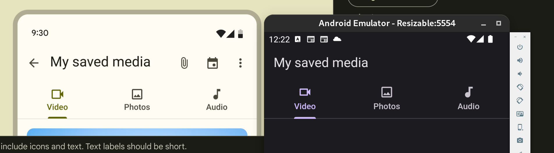
Reverts flutter/flutter#137618
Initiated by: Jasguerrero
This change reverts the following previous change:
Original Description:
It's now possible to natively compile a flutter app for
windows-arm64. Cross-compilation is not yet implemented.

Uses arm64 artifacts now available for Dart/Flutter.
Platform detection is based on Abi class, provided by Dart. Depending if
Dart is an arm64 or x64 binary, the Abi is set accordingly.
Initial bootstrap of dart artifacts (update_dart_sdk.ps1) is checking
PROCESSOR_ARCHITECTURE environment variable, which is the way to detect
host architecture on Windows.

This is available only for master channel (on other channels, it
fallbacks to windows-x64).

On windows-x64, it produces an x64 app. On windows-arm64, it produces an
arm64 app.
Previously `TextField`s error `cursorColor` was being derived without taking into account any `InputDecorationTheme` defaults. This change respects `InputDecorationTheme` defaults when deriving the error `cursorColor`.
Fixes#140607
Move static methods together.
Fix property uses of duplicate strings.
Add types wherever obvious
Fix format depth
Add whitespace to top and bottom of classes
Ignore line length for file
Ignore prefer single quote for file
Ignore correction for getFoo used instead of foo

Loosely related to flutter/flutter/issues/123934
This disables the expectation for `TileMode` stringification because
https://github.com/flutter/engine/pull/49786 is about to fix it (as in,
the test would fail when the engine fix lands).
Fixes#140046
This PR is to add a `headerHeight` property to `SearchAnchor` and `SearchViewThemeData` so the header height on the search view can be customized.
Rolls the packages from https://github.com/dart-lang/native in the native assets implementation.

Most notable we're refactoring `package:native_assets_cli` for `build.dart` use.
Therefore, all imports to that package for Flutter/Dart should be to the implementation internals that are no longer visible for `build.dart` writers. Hence all the import updates.

No behavior in Flutter apps should change.

This PR also updates the template to use the latests version of `package:native_assets_cli` which no longer exposes all the implementation details.
## Description

This adds a check to make sure that the `--empty` flag isn't applied to non-app templates.

## Related Issues
 - Fixes https://github.com/flutter/flutter/issues/141592

## Tests
 - Added a test.
I continued [my mission](https://github.com/flutter/flutter/pull/141431) to find as many typos as I could. This time it's a smaller set than before.

There is no need for issues since it's a typo fix.
`swift-format` alphabetizes imports.  Alphabetize them in swift template files and integration tests.

I found this as part of https://github.com/flutter/flutter/issues/41129 running `swift-import` on packages.
## Description
This PR addresses issue #141061, which requested the addition of a 'color' property to buttons extending _ActionButton. The 'color' property has been introduced to enhance customization options for these buttons.
## Issues Fixed
- Fixes#141061
Reverts flutter/flutter#141526
Initiated by: CaseyHillers
This change reverts the following previous change:
Original Description:
### Description
- Adds `BoxPainter` creation and disposal events dispatching for memory leak tracking as part of https://github.com/flutter/flutter/issues/141198

### Tests
- Updates `decoration_test.dart` to test `BoxPainter` object creation and disposal events dispatching.
Added missing required newline at end of some `.gitignore` files. All other `.gitignore` files ends with a newline except the changed ones, hence the PR.

> *List which issues are fixed by this PR. You must list at least one issue. An issue is not required if the PR fixes something trivial like a typo.*

**Not listing any issues because of trivial fixes as mentioned above.**
There's no issue for this PR. I can create one if requested.

## Summary

This PR makes public fields of `FlutterExtension` non-static. The aim is to make migrating from Gradle Groovy DSL to Gradle Kotlin DSL easier for Flutter developers, because...

### Without this PR

**android/app/build.gradle.kts**

```kotlin
plugins {
    id "com.android.application"
    id "dev.flutter.flutter-gradle-plugin"
}

android {
    namespace = "io.flutter.examples.hello_world"
    compileSdk = FlutterExtension.compileSdkVersion

    defaultConfig {
        applicationId = "io.flutter.examples.hello_world"
        minSdk = FlutterExtension.minSdkVersion
        targetSdk = FlutterExtension.targetSdkVersion
        // ...
    }
}
// ...
```

Groovy and Java allow accessing static fields of a class through its instance, but Kotlin is being more "correct" and disallows that.

### With this PR

Thanks to this PR, the user won't have to replace `flutter` with FlutterExtension in some places, thus decreasing possible confusion.

```kotlin
plugins {
    id "com.android.application"
    id "dev.flutter.flutter-gradle-plugin"
}

android {
    namespace = "io.flutter.examples.hello_world"
    compileSdk = flutter.compileSdkVersion

    defaultConfig {
        applicationId = "io.flutter.examples.hello_world"
        minSdk = flutter.minSdkVersion
        targetSdk = flutter.targetSdkVersion
        // ...
    }
}
// ...
```
Fixes  #140770 and #103124

Adds the possibility of passing a height and width to icons. And also a margin for the distance of the lines between the icons.
fixes [Invisible SliverAppBar title in Material 3 light theme](https://github.com/flutter/flutter/issues/138296)
fixes [`FlexibleSpaceBar` title is misaligned without the leading widget](https://github.com/flutter/flutter/issues/138608)
Previous attempt https://github.com/flutter/flutter/pull/138611
---
### Description
- fixes the `FlexibleSpaceBar` centered title position when there is a leading widget.
- fixes the `FlexibleSpaceBar` title color for Material 3.
- Added documentation when using a long `FlexibleSpaceBar` title and update its test.
- Improved documentation of default title padding.
### Code sample
### Code sample
<details>
<summary>expand to view the code sample</summary>
```dart
import 'package:flutter/material.dart';
void main() => runApp(const MyApp());
class MyApp extends StatelessWidget {
const MyApp({super.key});
@override
Widget build(BuildContext context) {
return const MaterialApp(
debugShowCheckedModeBanner: false,
home: Example(),
);
}
}
class Example extends StatelessWidget {
const Example({super.key});
@override
Widget build(BuildContext context) {
return const Scaffold(
body: SafeArea(
child: CustomScrollView(
slivers: <Widget>[
SliverAppBar(
leading: Icon(Icons.favorite_rounded),
flexibleSpace: FlexibleSpaceBar(
title: ColoredBox(
color: Color(0xffff0000),
child: Text('SliverAppBar'),
),
),
),
],
)),
);
}
}
```
</details>
### Before

### After
